LO5 P8: Be able to present a planned proposal that will widen audience reach through the use of converging technologies
Presentation:
I created this presentation to summarise my product and the different aspects I had researched surrounding my product. I discussed the overview, benefits, costs, target audience, distribution, and marketing methods on these slides. On the end slides, I showed examples of my designs, wireframes, and visualisation diagrams of how I am imagining and planning for my product to look like and be able to use. I then included the link to a survey to gather audience feedback and thanked them for listening.
Video Presentation:
Here is video evidence of my presentation where I go through my created slides and you can hear the feedback from Anne Doncaster, a university lecturer at Sheffield Hallam and an industry professional.
Prototype/Designs/Wireframes/Visualisation Diagrams:
This is my logo that I designed for MindManage. I wanted to include the name of the product in the logo surrounding by a person's outline. The name of the brand is where the brain would go to symbol the mind/mental aspect whereas the symbol of the heart and plus sign shows the health relation:
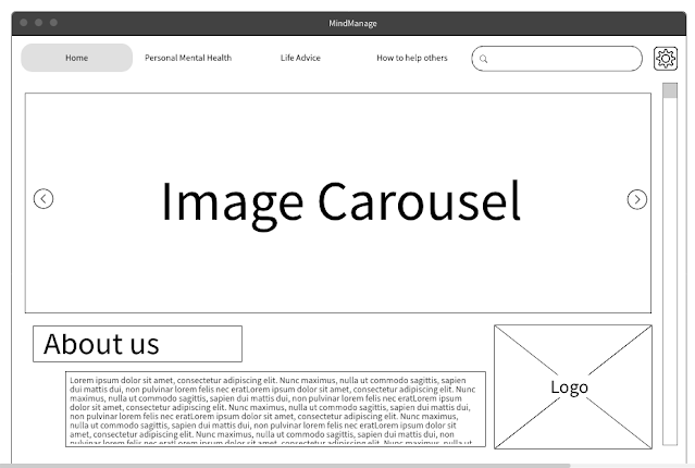
Here are the wireframes for the website version. Each wireframe has the same layout of the navbar at the top alongside the search bar and settings button. The wireframes show each tab of the navbar being clicked on shown by the darkened button at the top and depending on which tab is clicked the below buttons help the user navigate through the different sections on the webpages. The boxes with diagonal lines running through them are symbolic of the images which will be included on the website and an example of this can be seen in the created visualisation diagram after this:
Here is a visualisation diagram I made for the home page of the website version. The first one was eventually remade as I changed the colour scheme of the website as well as found the images I wanted to use specifically on the website. I also changed the placement of the logo and included another box with a link to advertise one of the pages on the website that users might find helpful on the home page when they are first introduced to the product's purpose. The second visualisation diagam is screenshotted within Adobe Photoshop which I used to create both diagrams. I changed the colour scheme from purple to more pastel pink, browns and reds because I wanted more of a colour palette to create better presentation to the consumers and I feel as if these colours are more calming and reassuring as stereotypically pink represents love and care:
Here are the wireframes for the mobile app version. The first one is what greets the consumers when they first open the app or if they log out of their accounts. The image shown in the wireframe will be my logo which can be seen in the visualisation diagram. The other wireframes show what the different activities will look like within the app version of my product. For example, the mood tracker is a calendar with the option to colour code each of the users moods:
Here is the visualisation diagram for the login page of the mobile app version. It follows the same colour scheme as the website to allow for continuity and familiar comfort for my target audience (which will appeal to the mainstreamers). The logo is inputted along with the coloured background. Each tab will allow the user to type in their login details before pressing the login button to sign in to the app officially:
This is a link to the prototype for my website version of the product:


Comments
Post a Comment